Zezuru Coffee aimed to build a distinctive brand identity that honored its cultural heritage while enhancing its storytelling and market positioning.
Solution
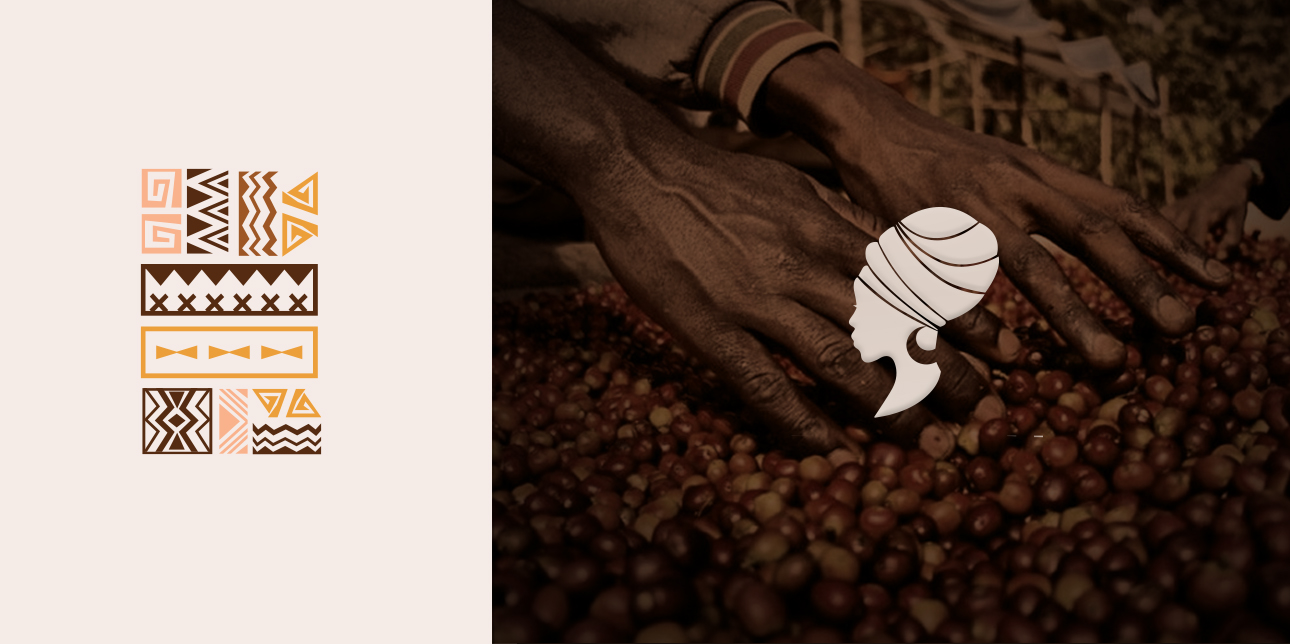
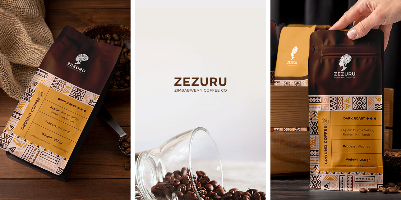
We crafted a brand identity that not only celebrates the rich flavors of their coffee but also pays homage to the cultural heritage of Zimbabwe. At the heart of this identity is the logo, carefully designed to reflect the essence of traditional tribal artistry. Inspired by the intricate patterns found in Zimbabwean crafts and textiles, the logo incorporates geometric elements that symbolize unity, strength, and craftsmanship values deeply embedded in the coffee-making process. The design embodies a raw, authentic feel, mirroring the dedication of the women behind Zezuru Coffee.
Beyond the logo, the branding embraces a warm and earthy color palette, drawing inspiration from the natural tones of coffee rich browns, deep ambers, and soft creams. These hues not only reflect the product itself but also create an inviting and organic aesthetic that resonates with authenticity. The tribal patterns woven throughout the packaging and visual identity further reinforce the connection to Zimbabwean heritage, ensuring that every element of the brand tells a story. This fusion of culture and design allows Zezuru Coffee to stand out while maintaining a deep emotional connection to its roots.
Get started now
If you would like to work with us or just want to get in touch, we’d love to hear from you!
Email
hello@archistrystudios.com
Address
2001 20/F Kaiser Centre, Centre Street,Sai Ying Pun -Hong Kong