Flying Fox required a packaging system that could evolve across flavours while maintaining a strong, recognisable identity.
Solution
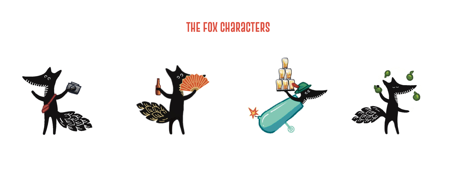
We built a character led packaging system rooted in consistency and storytelling.
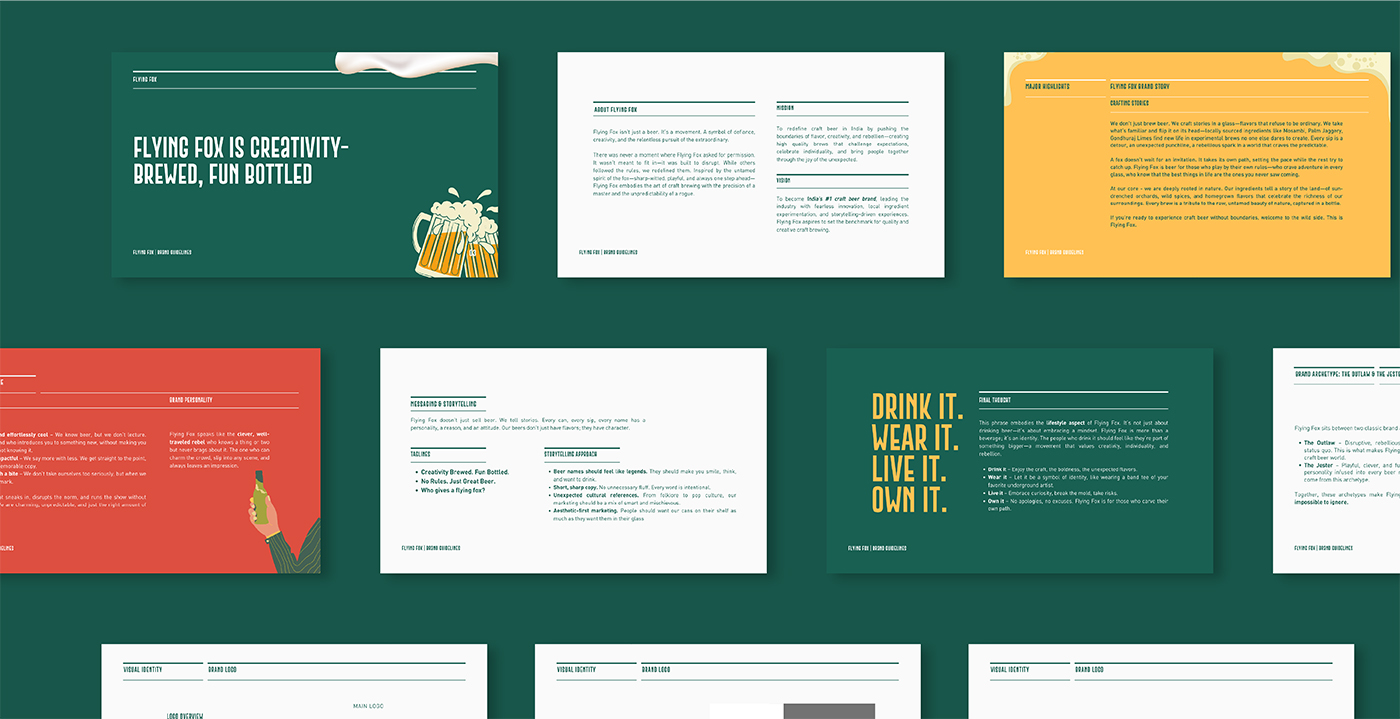
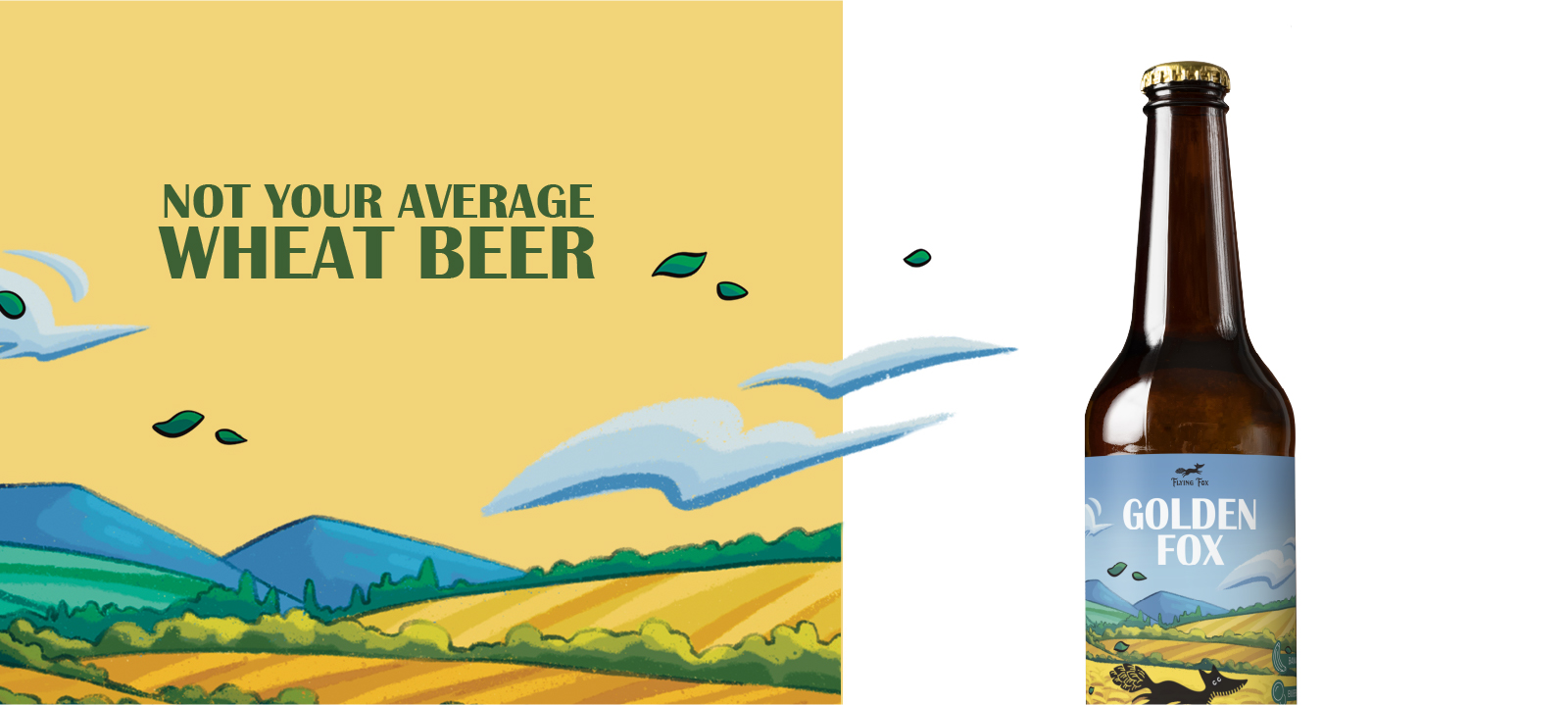
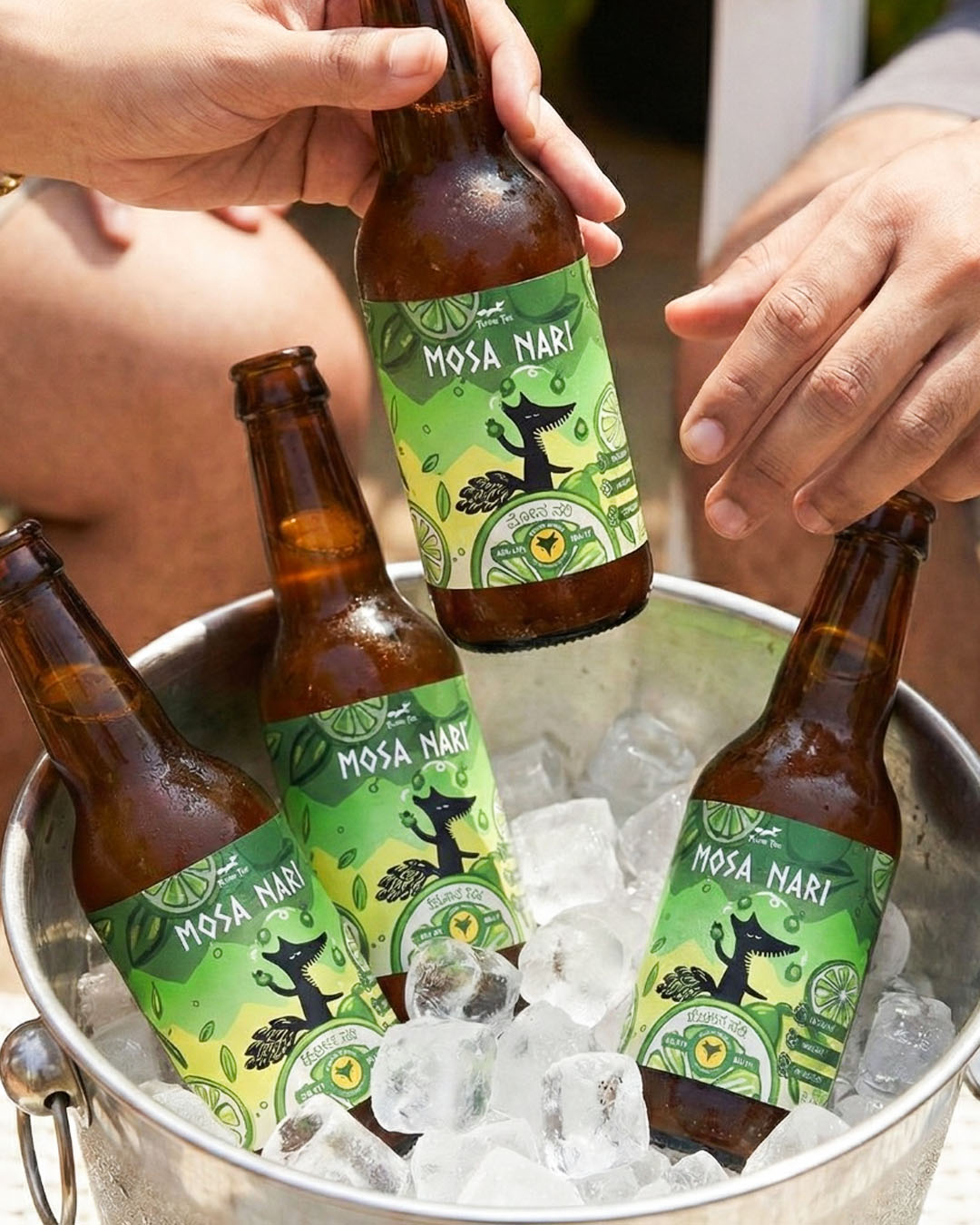
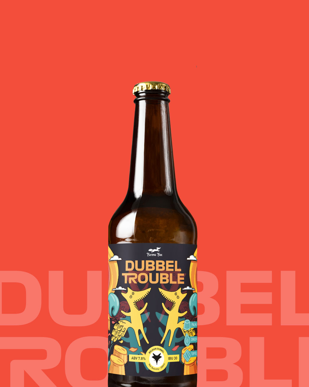
At the core sat a strong brand framework. Clear typography. Defined hierarchy.
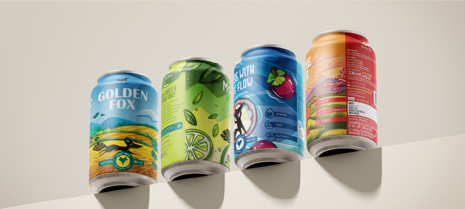
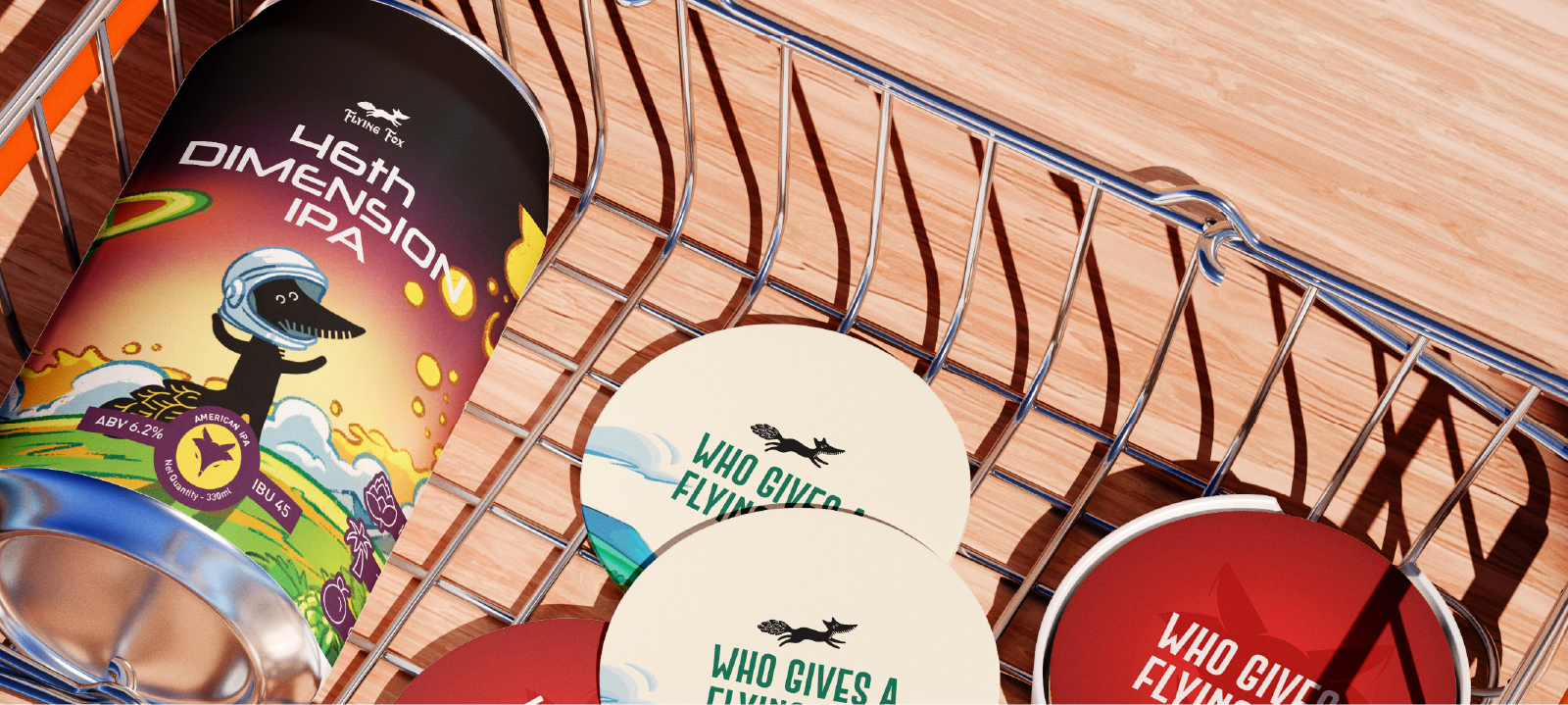
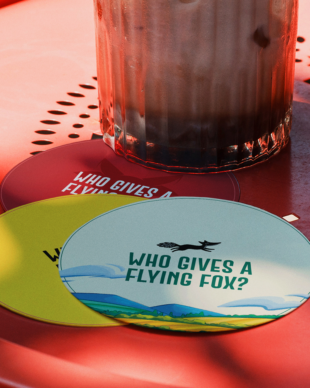
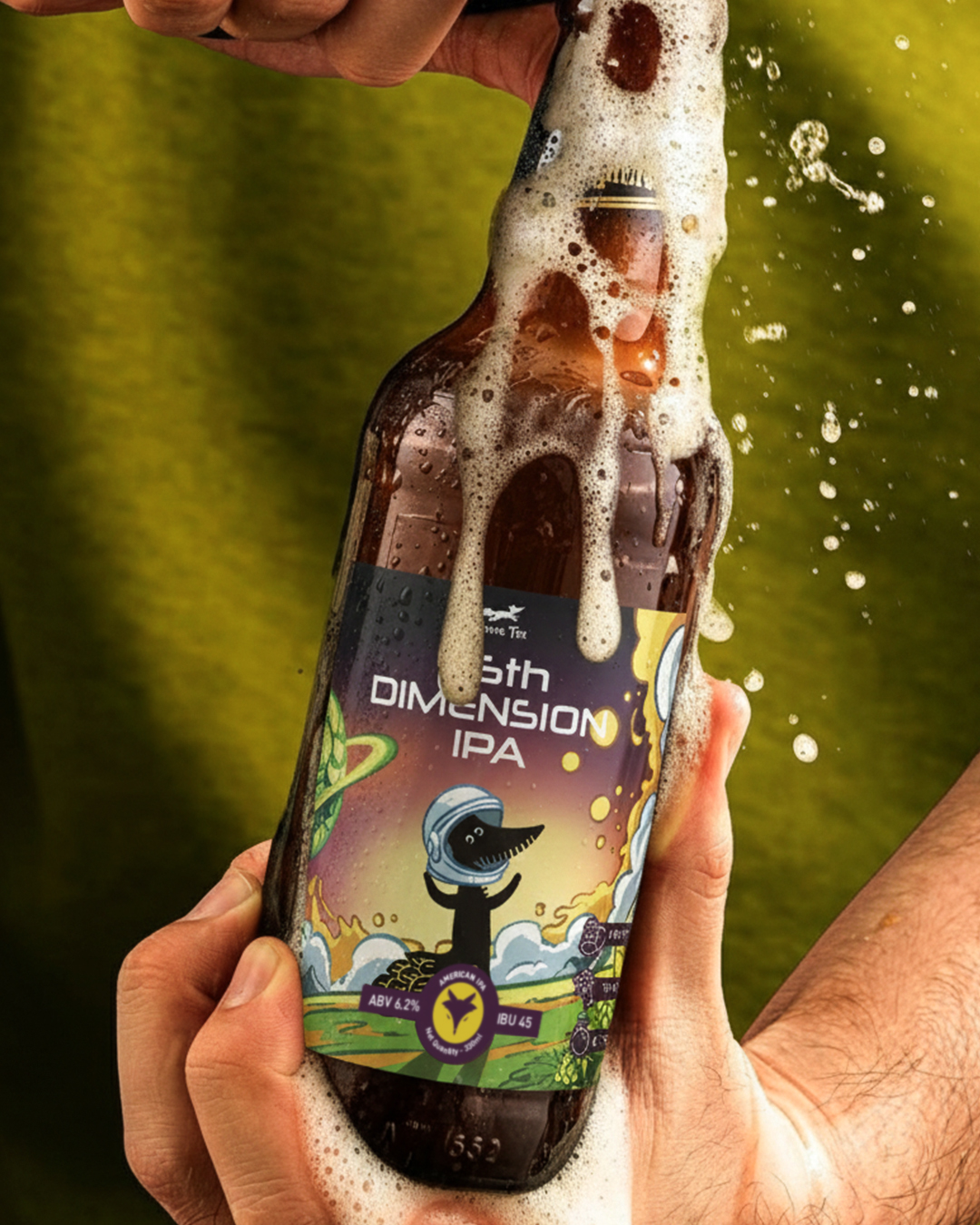
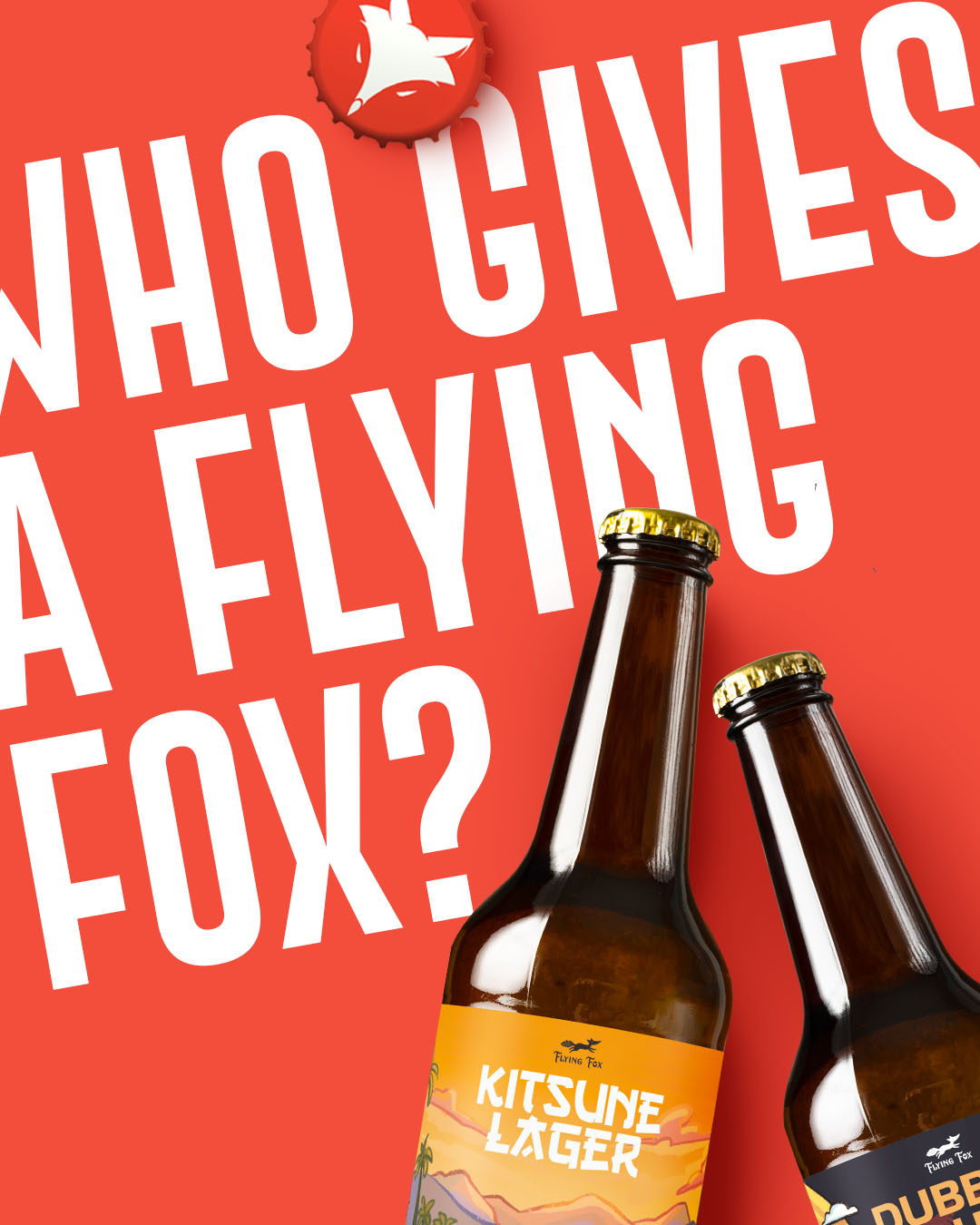
A disciplined layout that could stretch across formats and flavours. Within this structure, we introduced illustrated fox characters, each designed to reflect the personality, mood, and taste profile of its beer. Every label follows the same system, yet no two bottles feel the same. The illustrations shift. The colours evolve. The fox adapts. What stays constant is recognisability on shelf.
The result is a packaging system that feels playful but controlled. Expressive but scalable. Designed to grow with the brand without ever losing its edge.
Get started now
If you would like to work with us or just want to get in touch, we’d love to hear from you!
Email
hello@archistrystudios.com
Address
2001 20/F Kaiser Centre, Centre Street,Sai Ying Pun -Hong Kong